system + palette

carefully crafted palettes to help you start projects fast.

content

content.base

all your designs starts from base. They have, if necessary, their state(s) equivalent.

#020A19

var(--cnt-primary)

primary

the default color for content.

#5D5E60

var(--cnt-secondary)

secondary

for subtle content

#A2A5A9

var(--cnt-tertiary)

tertiary

for footnotes, legends,etc.

#FFFFFF

var(--cnt-onbold)

on-bold

default content on bold backgrounds

#7910FF

var(--cnt-accent)

accent

for highlight interactive content

#1062FF

var(--cnt-info)

info

for informative messages

#128700

var(--cnt-success)

success

for success or positive information

#E32D00

var(--cnt-warning)

warning

for important information

#E00018

var(--cnt-danger)

danger

for critical information

#7910FF

var(--cnt-accent-hover)

accent hover

the hover state of accent cnt

#7910FF

var(--cnt-accent-pressed)

accent pressed

the pressed state of accent cnt

#0068D6

var(--cnt-info-hover)

info hover

the hover state of info cnt

#0063CC

var(--cnt-info-pressed)

info pressed

the pressed state of info cnt

#0C7E3A

var(--cnt-success-hover)

success hover

the hover state of success cnt

#0C7E3A

var(--cnt-success-pressed))

success pressed

the pressed state of success cnt

#C23D00

var(--cnt-warning-hover)

warning hover

the hover state of warning cnt

#C23D00

var(--cnt-warning-pressed)

warning pressed

the pressed state of warning cnt

#D60017

var(--cnt-danger-hover)

danger hover

the hover state of danger cnt

#CC0016

var(--cnt-danger-pressed)

danger pressed

the pressed state of danger cnt

backgrounds

base backgrounds

all your designs starts from base. they have, if necessary, their state(s) equivalent.

#FFFFFF

var(--bg-main)
main

default color for bg

#F6F6F8

var(--bg-alternative)

alternative

alternative color for bg

#F4EBFF

var(--bg-accent-soft)

accent soft

for subtle branded or accent bg

#7910FF

var(--bg-accent-bold)

accent bold

for highly visible branded or accent bg

#EBF5FF

var(--bg-info-soft)

info soft

for subtle informative cnt bg

#1062FF

var(--bg-info-bold)

info bold

for highly visible for subtle informative cnt bg

#E6FAEF

var(--bg-success-soft)

success soft

for subtle positive cnt bg

#0C823C

var(--bg-success-bold)

success bold

for highly visible positive cnt bg

#FFF3EB

var(--bg-warning-soft)

warning soft

for subtle important cnt bg

#FA5C00

var(--bg-warning-bold)

warning bold

for highly visible important cnt bg

#FFF0F1

var(--bg-danger-soft)

danger soft

for subtle yet critical cnt bg

#D50017

var(--bg-danger-bold)

danger bold

for highly visible critical cnt bg

#F1F1F3

var(--bg-main-hover)

main-hover

hover state of main bg

#EBEBED

var(--bg-main-pressed)

main-pressed

pressed state of main bg

#EEEEF2

var(--bg-alt-hover)

alternative-hover

hover state of alt bg

#E5E5EB

var(--bg-alt-pressed)

alternative-pressed

pressed state of alt bg

#EBDBFF

var(--bg-accent-soft-hover)

accent soft hover

hover state of accent soft bg

#E8D6FF

var(--bg-accent-soft-pressed)

accent soft pressed

pressed state of accent soft bg

#6000DB

var(--bg-accent-bold-hover)

accent bold hover

hover state of accent bold bg

#4C00AD

var(--bg-accent-bold-pressed)
accent bold pressed

pressed state of accent bold bg

#E0F0FF

var(--bg-info-soft-hover)

info soft hover

hover state of info soft bg

#D6EBFF

var(--bg-info-soft-pressed)

info soft pressed

pressed state of info soft bg

#0051F5

var(--bg-info-bold-hover)

info bold hover

hover state of info bold bg

#0047D3

var(--bg-info-bold-pressed)

info bold pressed

pressed state of info bold bg

#E6FAEF

var(--bg-success-soft-hover)

success soft hover

hover state of success soft bg

#E6FAEF

var(--bg-success-soft-pressed)
success soft pressed

pressed state of success soft bg

#0A7034

var(--bg-success-bold-hover)

success bold hover

hover state of success bold bg

#09672F

var(--bg-success-bold-pressed)

success bold pressed

pressed state of success bold bg

#FFEDE0

var(--bg-warning-soft-hover)

warning soft pressed

hover state of warning soft bg

#FFEADB

var(--bg-warning-soft-pressed)
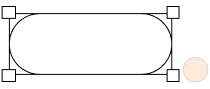
warning soft pressed

pressed state of warning soft bg

#E55500

var(--bg-warning-bold-hover)

warning bold hover

hover state of warning bold bg

#D14D00

var(--bg-warning-bold-pressed)

warning bold pressed

pressed state of warning bold bg

#FFE5E8

var(--bg-danger-soft-hover)

danger soft hover

hover state of danger soft bg

#FFDBDF

var(--bg-danger-soft-pressed)
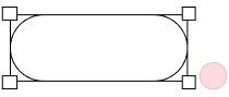
danger soft pressed

pressed state of danger soft bg

#B80014

var(--bg-danger-bold-hover)

danger bold hover

hover state of danger bold bg

#A30011

var(--bg-danger-soft-pressed)

danger bold pressed

pressed state of danger bold bg

borders

base borders

no states for borders, if needed extend the system

#DBDBDC

var(--brd-main)

main

for dividers and subtle brd

#C5C5C7

var(--brd-alternative)

alternative

for more constrasted brd like fields

#7910FF

var(--brd-accent)

accent

for more visibility or contrast

#1062FF

var(--brd-info)

info

for more visibility or contrast

#128700

var(--brd-success)

success

for more visibility or provide action positive feedback

#E32D00

var(--brd-warning)

warning

for more visibility or provide attention feedback

#E00018

var(--brd-danger)

danger

for more visibility or provide critical feedback

page backgrounds

base page backgrounds

obviously no states

#FFFFFF

var(--pagebg-main)

main

the default page bg

#F6F6F8

var(--pagebg-alternative)

alternative

for and alternative page bg

discover contributors